
Using CSS Media Queries to Optimize for Touchscreen Devices
CSS hover effects are nice interactions that add some polish to a web application. Hover actions are also frequently used to display additional information (like a tooltip) for a piece of content - for example, an abbreviation or icon button. However, on most touchscreen devices, the hover action is either not available entirely, or doesn't work well. At best, this causes your beautiful buttons and other hoverable elements to feel janky on mobile. At worst, you app may be unuable on some devices.
Touch devices are primarily mobile devices, and building a poor mobile experience simply isn't an option: over half of internet traffic comes from mobile devices. Let's look at how to use CSS to change our app's behavior, and optimize for a great user experience across all input methods.
Detecting Hover State Availability
It all comes down to being able to detect whether a browser has the hover capability
or not. We can use an @media query to detect if hover is available:
@media (hover: hover) {
  a:hover {
    background: transparent;
    color: white;
  }
}
css
The hover style will only be applied if the device's primary input mechanism supports hover events. But what does that mean exactly?
According to the MDN Web Docs,
the hover feature query gets the value hover when "The primary input mechanism can conveniently
hover over elements." The word conveniently is doing a lot of work here, but it's a bit
ambiguous. While the iPhone, for example, does trigger hover events after an awkward
longer-than-normal press, it's not a convenient interaction, so the hover feature value
is none. Other times the value is none are when
the primary input mechanism cannot hover at all, or there is no pointing mechanism (i.e. a mouse).
If you want to target this negative state, you can check the hover feature again, this time for the
none value:
@media (hover: none) {
  a {
    color: black;
  }
}
css
You can also use the inverse of the hover: hover feature query as well:
@media not (hover: hover) {
  a {
    color: black;
  }
}
css
Applications
One application of this pattern is for showing touch users content that is normally only available on hover - for example, a tooltip. If you have an icon button that performs an action, you should at the very least have a tooltip that indicates what the button does. On touch devices, this tooltip won't be useful, because it will never show (or at least be inconvenient to trigger). Here's an example of how we can solve this with CSS:
<button data-tooltip-text="Go Home">
  <!-- Assume this renders a home icon -->
  <i data-icon="home" />
</button>
html
/* Applies on devices with hover events */
@media (hover: hover) {
button:hover::after {
content: attr(data-tooltip-text);
background-color: #363636;
position: absolute;
padding: 2px 6px;
margin-left: 4px;
color: white;
border-radius: 8px;
}
}
/* Applies on devices without hover events (like a phone) */
@media not (hover: hover) {
button::after {
content: ' · ' attr(data-tooltip-text);
}
}
cssWhen the hover feature is available, the tooltip text is displayed on hover in a tooltip! When the hover feature is not available, it's displayed inline in the content, eliminating the need for a tooltip all together.
I built a little demo page available here that shows these different behaviors. Check it out on your mobile and desktop browser to see the difference!
Debugging
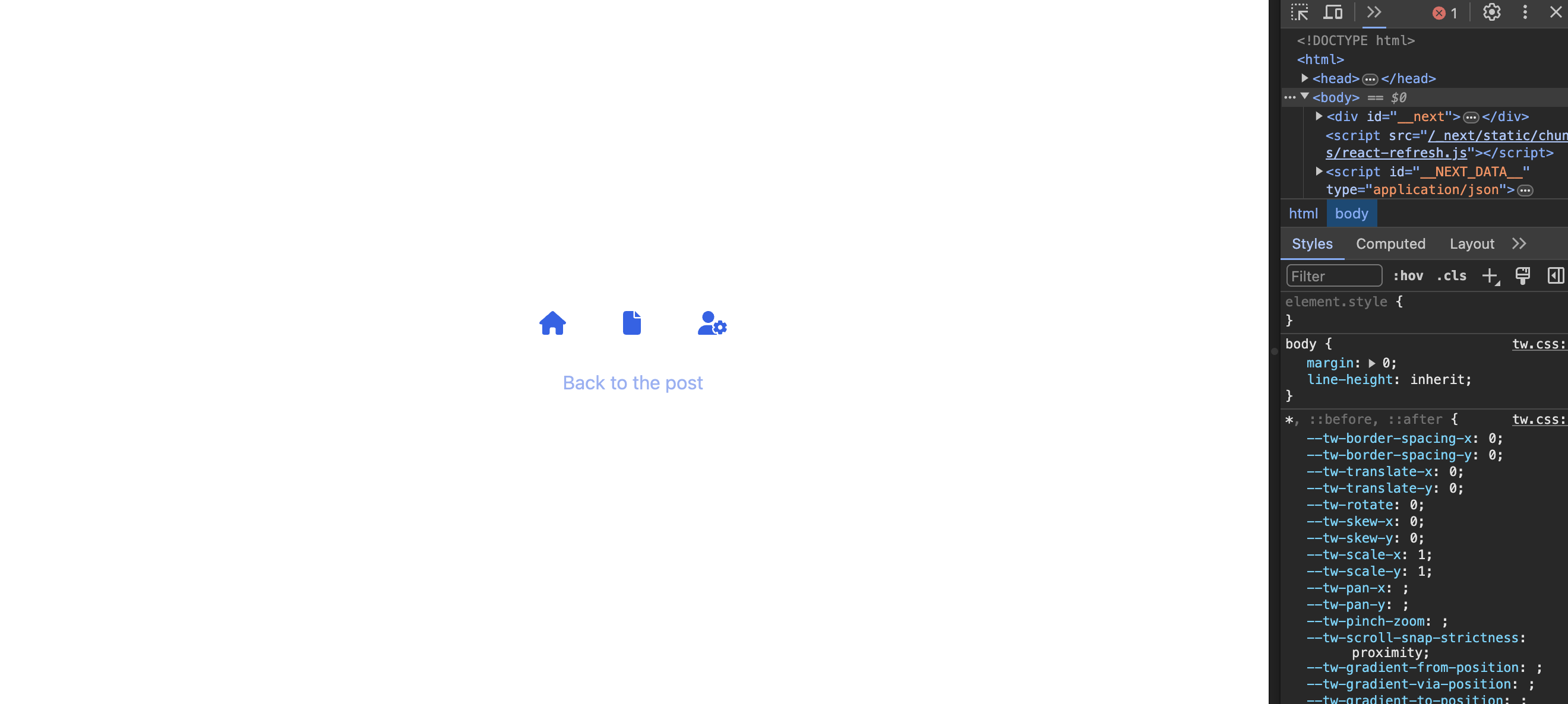
You don't want to have to pull out your mobile phone every time you want to test these CSS rules and queries. Luckily, the Chrome developer tools allow you to emulate this property super easily, just by toggling on responsive mode. Here's the desktop version of my example:
After turning on the responsive design viewer, I get the non-hoverable state:
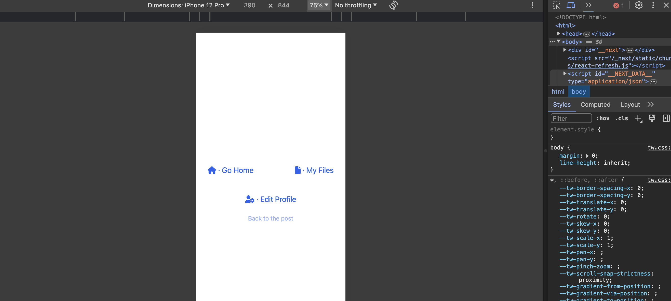
Pretty handy! I use this a lot to go back and forth between designing for touch interfaces and non-touch interfaces.
Conclusion
This is a simple pattern that's highly flexible when creating complex designs. It's a useful tool for my button hover states, but as you can see, there are are lot more opportunities out there to build some interesting, truly responsive interfaces that are accessible to users of all devices.